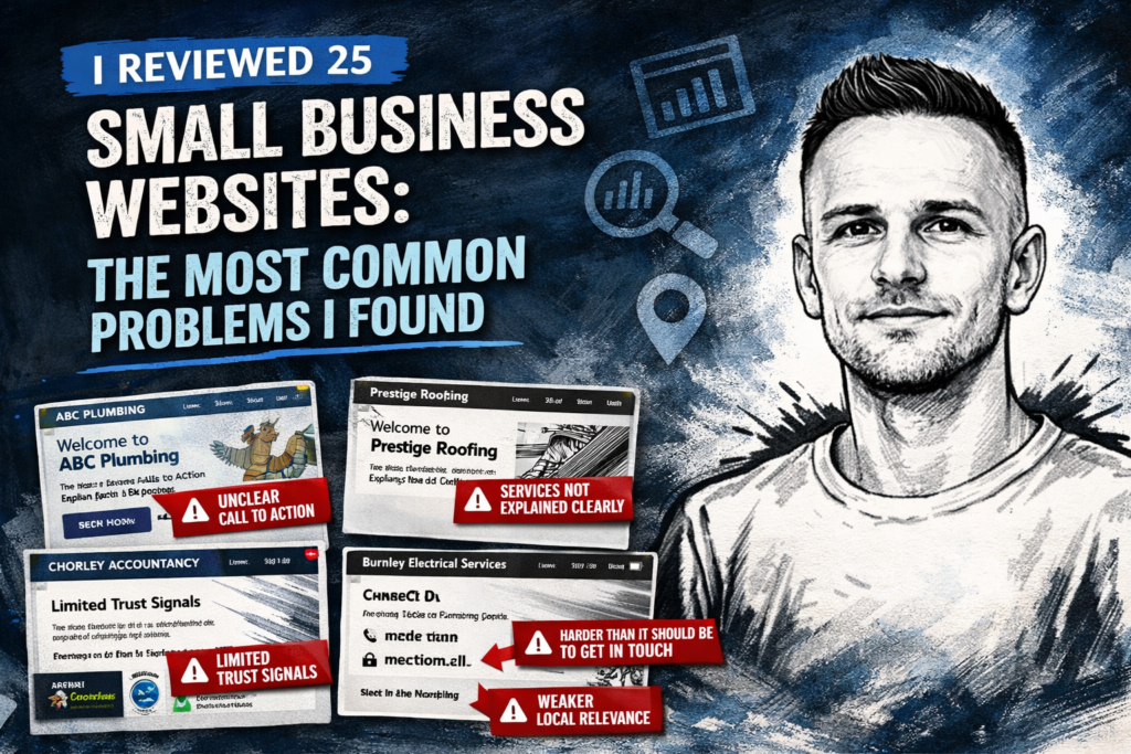
A lot of small business owners assume their website is probably fine as long as it looks reasonably modern and loads without an obvious error.
In reality, many small business websites are not underperforming because of one major technical fault. More often, they are being held back by a collection of smaller issues that reduce trust, make the site harder to use, and give potential customers fewer reasons to get in touch.
To get a clearer picture of what is actually going wrong, I manually reviewed 25 local service websites and looked for common issues that affect clarity, trust and enquiries.
This was not about naming and shaming any individual business. The aim was simply to identify the recurring problems I see most often on small business websites, especially the ones that can usually be improved without a full rebuild.
How I reviewed the websites
For this mini review, I looked at 25 local-service websites across Blackburn, Preston, Burnley, Chorley and Blackpool. The sample included a mix of trades and service businesses, including plumbing, electrical, accountancy, dentistry, and roofing or building firms.
I looked mainly at homepages, service pages and contact pages, and reviewed each site against a simple set of practical criteria, including:
- whether the call to action was clear
- whether the business explained its services clearly
- whether trust signals were visible
- whether it was easy to get in touch
- whether the site showed clear local relevance
- whether the website felt dated, cluttered or harder to use than it needed to be
This was a quick manual review rather than a deep technical audit. I was not measuring every possible SEO or development factor. I was looking at the kind of practical issues that affect whether a visitor trusts the site and decides to make an enquiry.
Quick findings summary
Out of the 25 websites reviewed:
- 13 had weak or unclear calls to action
- 4 did not explain their services clearly enough
- 6 had limited trust signals on key pages
- 13 made contacting the business harder than it should have been
- 4 had weaker local relevance than expected
- 6 felt dated, cluttered or harder to use than necessary
Even where the websites were not completely broken, many were underperforming because the basics were not being handled strongly enough.
1. Weak or unclear calls to action were one of the most common problems
This was one of the clearest patterns in the review.
On many websites, it was not obvious what the visitor should do next. A person might land on the homepage or a service page and still be left wondering whether they should call, fill out a form, request a quote, or keep clicking around for more information.
Some sites had no clear call to action at all. Others had one, but it was buried too low down the page or lost among too many competing elements.
For a small business website, this matters more than many owners realise. If the website does not guide the visitor clearly, some of them will simply leave and move on to the next option.
A website does not need aggressive sales language, but it should make the next step obvious.
2. Some websites still did not explain their services clearly enough
This came up less often than the call-to-action issue, but it was still a problem on a number of sites.
In some cases, the business owner clearly knew exactly what they offered, but the website assumed the visitor already understood it too. That led to vague headings, generic wording, weak service descriptions, or pages that never properly explained what was included.
A visitor should not have to work hard to understand what a business does, who it helps, or what kind of job it takes on.
Often, the problem was not that the business lacked a good service. The problem was that the website did not explain it clearly enough or quickly enough.
3. Trust signals were often thinner than they should have been
Another recurring issue was limited proof.
A website may look tidy, but if it lacks credibility signals, it can still feel uncertain. On several of the sites reviewed, there was very little to reassure a potential customer that the business was established, reliable or worth contacting.
Common missing trust signals included:
- testimonials
- recent project examples
- case studies
- before-and-after work
- clear business details
- evidence of experience
- photos of real work
This is especially important for local services and small businesses, where trust is often a deciding factor. People want confidence before they make an enquiry.
Trust is often built through small details. When those details are missing, the website can feel thinner than it should.
4. Contacting the business was often harder than it needed to be
This was tied for the most common issue in the review.
Some websites had contact forms that were harder to find than expected. Others had minimal contact information, weak contact pages, or no clear prompt encouraging the visitor to get in touch.
On a surprising number of sites, basic contact friction showed up in ways like:
- the phone number not being prominent
- no obvious enquiry button
- contact options being tucked away
- weak or bare contact pages
- a contact form without much context
- no clear sense of response expectations
This is simple, but it affects enquiries directly.
If the purpose of the website is to generate leads, the contact path should feel easy and obvious. A visitor should not have to hunt around for how to reach the business.
5. Local relevance was sometimes weaker than expected
This was not the biggest issue overall, but it did come up on a number of sites.
For businesses serving a defined area, some websites were not clear enough about where they actually work. The service area was vague, important towns were not mentioned, or the site felt too generic to build much local relevance.
A small business does not need to stuff place names everywhere, but it should make it easy for the visitor to see that the business serves their area.
This matters for two reasons. First, it helps the visitor feel they are in the right place. Second, it supports local visibility in search.
For local businesses, relevance and clarity go together.
6. Some websites felt dated, cluttered or harder to use than necessary
This does not mean every older-looking website needs a full redesign.
But there is a difference between a simple website and a clunky one.
Some of the sites reviewed felt heavier, messier or more dated than they needed to be because of things like weak spacing, inconsistent styling, busy layouts, dated imagery, poor hierarchy, or too many competing elements on the page.
Often, the biggest problem was not just aesthetics. It was that the design made the website harder to scan, harder to trust, and harder to use.
That matters because a small business website does not need to be flashy, but it does need to feel clear, current and easy to navigate.
The bigger pattern I noticed
One of the most important things this review reinforced is that the real issue is often not design alone.
A lot of website advice focuses too heavily on appearance, but many of the weaknesses I saw were really communication problems. The businesses were often capable and genuine, but the websites did not present that clearly enough.
The common gaps were things like:
- unclear next steps
- weak service explanations
- not enough proof
- friction around making contact
- pages that felt harder to use than they should
A website can look reasonably modern and still underperform. Equally, a simple website can still work well if it communicates clearly, builds trust and makes the next step easy.
That is an important distinction.
What these problems cost a small business
Many of these issues seem small on their own. Together, they can quietly reduce the effectiveness of the website.
The likely cost includes:
- fewer enquiries
- lower trust
- more abandoned visits
- weaker local visibility
- wasted paid traffic
- missed opportunities from people who were interested but not quite convinced
In other words, a website does not need to be broken to underperform.
That is why regular review matters.
A simple checklist for your own website
If you run a small business website, these are a few useful questions to ask:
- Is it immediately clear what the business offers?
- Is there a clear next step on each important page?
- Is it easy to contact the business?
- Is there enough proof to build trust?
- Does the site clearly show where the business works?
- Does the website feel current, clear and easy to use?
If the answer to several of those is no, the website may be costing you more than you realise.
Final thoughts
Reviewing these 25 websites reinforced something important: most small business websites do not fail because of one dramatic problem. They fail because the basics are not being handled strongly enough.
Clear calls to action, straightforward service explanations, visible trust signals, an easy contact path and a cleaner user experience all matter more than many small businesses realise.
The good news is that these problems are often fixable.
A site does not always need a full rebuild. Sometimes it needs clearer structure, better messaging, stronger service pages, improved trust signals, or a few practical fixes that make the whole website more effective.
If your website feels unclear, outdated, underwhelming or weaker than it should be, I can help with website fixes, website improvements and small business web design support. Take a look at my website pricing or get in touch to discuss what your site needs.
Need this done properly?
I work directly with small businesses on web design, WordPress fixes, Shopify support and local SEO. No agency overhead.
See web design in Blackburn →